Make Text Stand Out
Some websites have poor contrast. Light gray text on white backgrounds. Thin fonts that disappear. It's hard to read even with good vision.
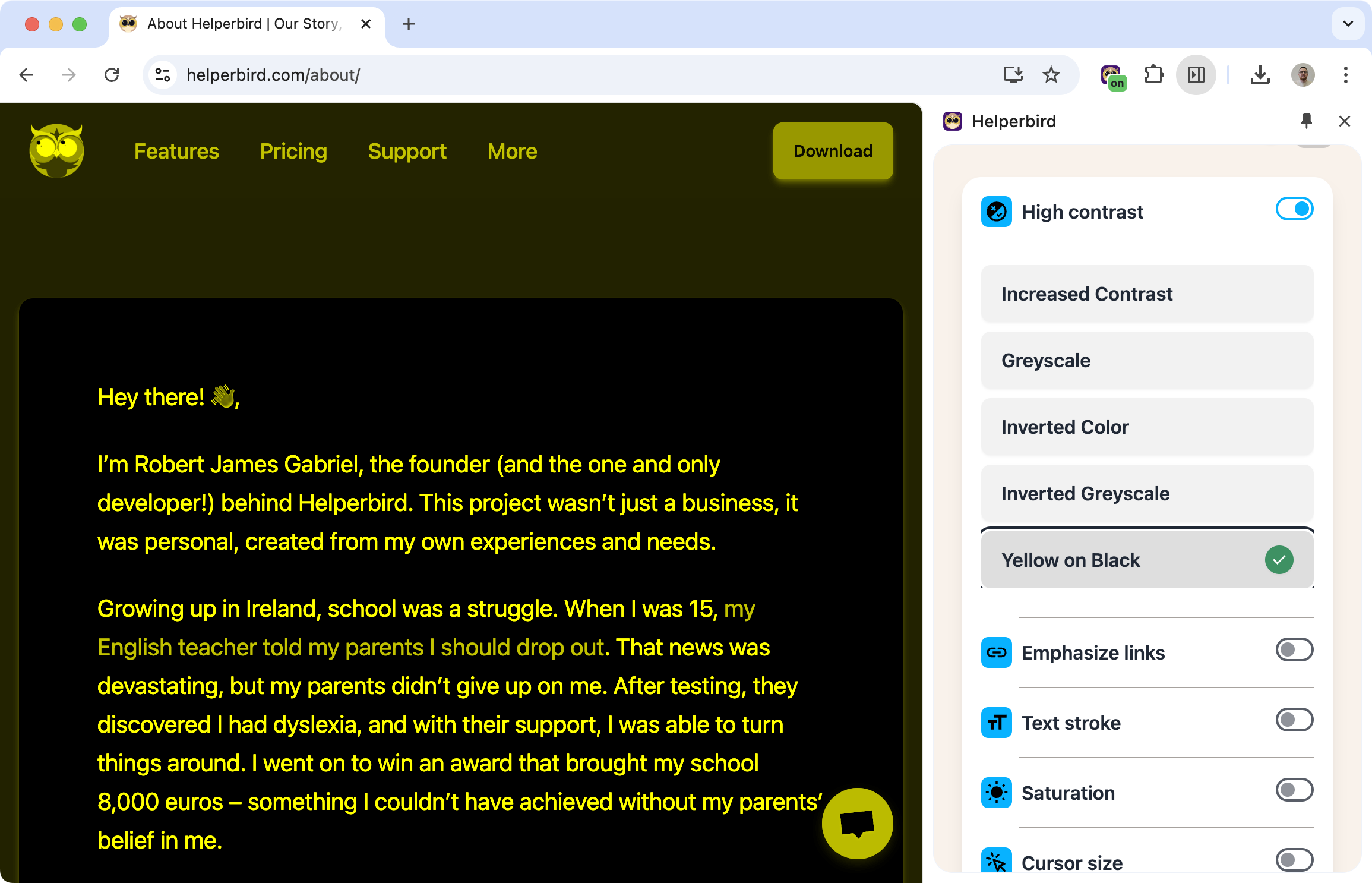
High contrast mode fixes that. Apply a theme that makes text bold and clear against its background.
Learn how to enable high contrast mode
Related features
- Color Overlay - Apply a colored tint to make reading more comfortable and reduce eye strain.
- Color Blindness Support - Make links and interactive elements easier to identify.
- Grayscale Mode - Remove distracting colors while maintaining strong contrast.
Available Themes
Inverted colors: Swap dark and light, making most sites dark-on-light.
Yellow on black: High visibility combination, popular for low vision users.
Grayscale: Remove color distractions while keeping contrast.
Inverted grayscale: Dark background with light gray text.
Increased contrast: Boost the existing contrast without changing colors dramatically.
Why High Contrast Helps
Low vision: When text is hard to see, high contrast makes it readable.
Color blindness: Removing or simplifying colors can make content clearer.
Eye strain: Strong contrast means your eyes don't have to work as hard to distinguish text from background.
Poor website design: Some sites just have bad contrast. High contrast mode overrides their choices with something readable.
Who Uses This
People with low vision who need strong contrast to read.
Users with color blindness who benefit from simplified color schemes.
Anyone reading in bright light where low-contrast text washes out.
Night readers who want a dark theme across all sites.
Is This Free?
Yes. High contrast mode is free in Helperbird.